Bulletin Board
What is a “Bulletin Board”?
Bulletin Board is what plays on our broadcast channels when there is no program / show scheduled to play. The bulletin board will cycle through slides that residents, non-profits, and city departments submit to us to play.
It’s a great resource to get the word out about anything you want to get more publicity about. The best part is its entirely free. There is no fee for using our bulletin board.
To get started, read “What makes a good Bulletin Slide” below. Once you’ve designed your slides, you can send them to jim@concordcctv.org, share them with with us via a file share service such as Google Drive or Dropbox, or drop them off at our station on a USB drive during business hours.

What makes a good Bulletin Slide?
Here’s what makes a good bulletin board slide:
Properly Sized
Slides on the bulletin board system need to be sized to fit. Use a 1080p resolution, which is 1920×1080, or a 16:9 aspect ratio (We no longer use 720 x 480 pixels, or the old 4:3 aspect ratio).
Broadcast Safe Colors
When designing your slides, Don’t use bright colors for two reasons. One reason is that a bright color on a bright background is very hard to read. Also, bright colors like a bright red cause “text bleed” on television screens, making the text look blurry.
Large Fonts
We recommend not going below a 24 point font when designing your slides. Fonts that are too small can appear blurry on the bulletin board slides. To play it safe, don’t go beneath 24 point font
Light on the Text
Slides generally appear on screen for no longer than 7 seconds, so you’ll want to make sure they can be read in that amount of time. Don’t stuff too much content into your slides. If need be, span your material across multiple slides.
Title Safe Margins
In the world of broadcasting there’s a term called Title Safe. This is where you avoid putting text or other import items in the margins of your content. Basically, avoid putting things near the edges of your slides. For more information about title safe, read this informative article.
If you have any questions about submitting slides, send us an e-mail!
Examples of slides
This slide isn’t good because the color contrasting makes it extremely hard to read. White fonts on bright backgrounds are often illegible to all but the sharpest of eyes. Before sending a slide to us, have a few colleagues or friends look at it. See if they can read / make sense of the slide. Use fonts that are easy to read. Avoid bright colors.

Design wise, this slide is good. It has good font sizes, explains whats going on, and it can be read quickly. However, our bulletin board cannot be used to promote Commercial events for a for profit business. The bulletin board cannot be used for commercial purposes.

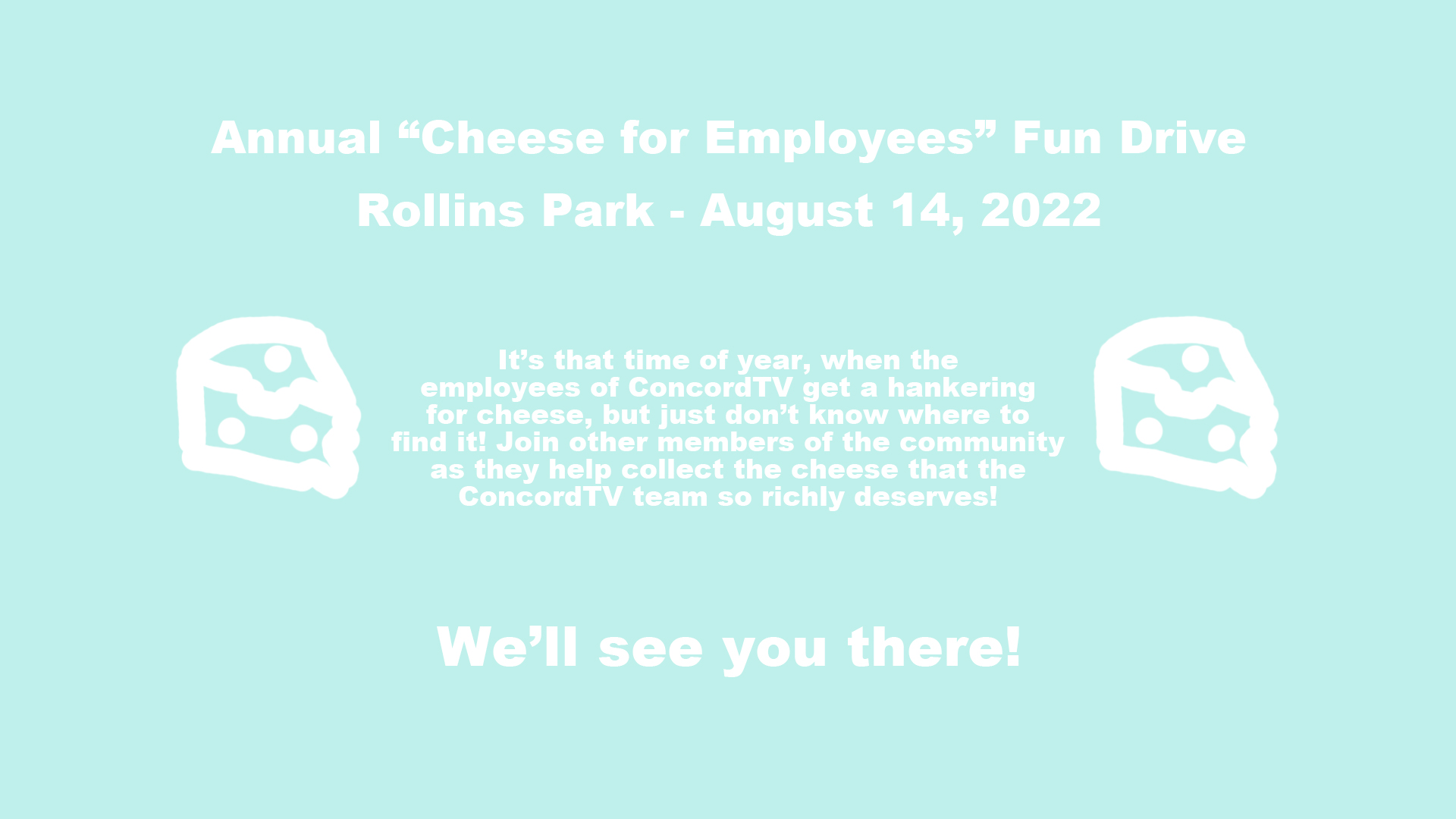
This slide is good. It’s straight forward, with not too much reading, and makes sense. It has a good color selection, and the text isn’t too close the sides. It promotes an event being sponsored by the Concord Public Library. Big fonts, easy to read, good colors supporting city, school, or non-commercial events make for great slides.